Newslaundry
A UX Research Study on Inclusive News Design

DURATION
CLIENT
ROLE
SITE
Newslaundry
3 Months
UX Researcher
https://www.newslaundry.com/
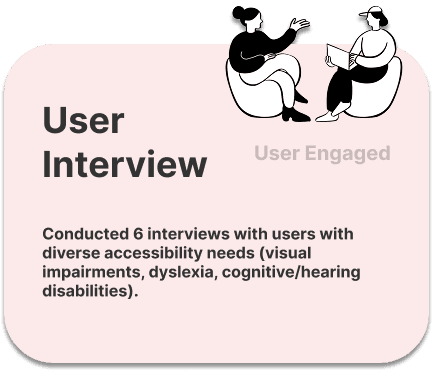
As our client, Newslaundry sought to improve accessibility for a more inclusive experience. Through evaluation, testing, audits, benchmarking, and interviews, we identified key UX barriers and provided recommendations.
Newslaundry is an independent, ad-free news platform offering investigative reporting and analysis. It runs on a subscription model to ensure editorial independence.
Challenge
Despite Newslaundry’s efforts to provide quality news content, the platform lacked the necessary accessibility features to serve users with disabilities with better user experience. How do we ensure that users with disabilities can engage meaningfully with Newslaundry’s content?
“My biggest problem with dyslexia is misreading words. So, if the text is really tight or small, it gets a lot harder to find my spot... blocks of text are just exhausting.”
“Sometimes poorly structured content or images without description can be challenging. I have to open and close the reader multiple times, which is quite annoying.”


User Interviewee 1
User Interviewee 2
Approach
Research Methods Overview

Insights
We found users struggles with
Insights
Variations in content contrast and font size reduce readability.
We found users struggles with
Unlabeled buttons and inconsistent focus indicators.
Lack of consistent accessibility features.
Navigation Issues
Accessibility Gaps
Design Inconsistencies
Insights
Variations in content contrast and font size reduce readability.
We found users struggles with
Unlabeled buttons and inconsistent focus indicators.
Lack of consistent accessibility features.
Navigation Issues
Accessibility Gaps
Design Inconsistencies
Insights
Variations in content contrast and font size reduce readability.
We found users struggles with
Unlabeled buttons and inconsistent focus indicators.
Lack of consistent accessibility features.
Navigation Issues
Accessibility Gaps
Design Inconsistencies
Unlabeled buttons and inconsistent focus indicators.
Navigation Issues
1
Lack of consistent accessibility features.
Accessibility Gaps
2
Inconsistent contrast and font size reduce readability.
Design Inconsistencies
3
Solutions
Hi-Fidality Re-design

"Every participant struggled to find content due to the inconsistent layout and lack of clear filters, creating a barrier to accessing information."
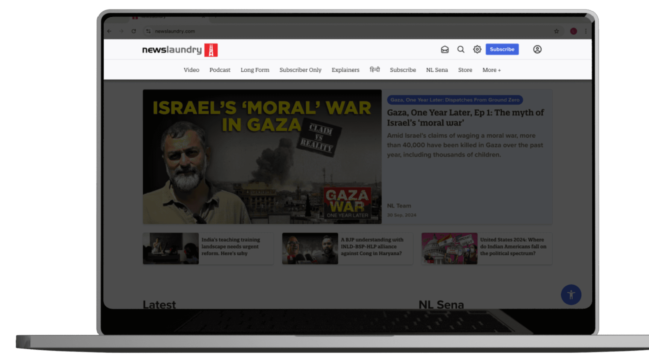
01 Navigation Issues → Simplifying Navigation
Original Navigation
Re-designed Navigation
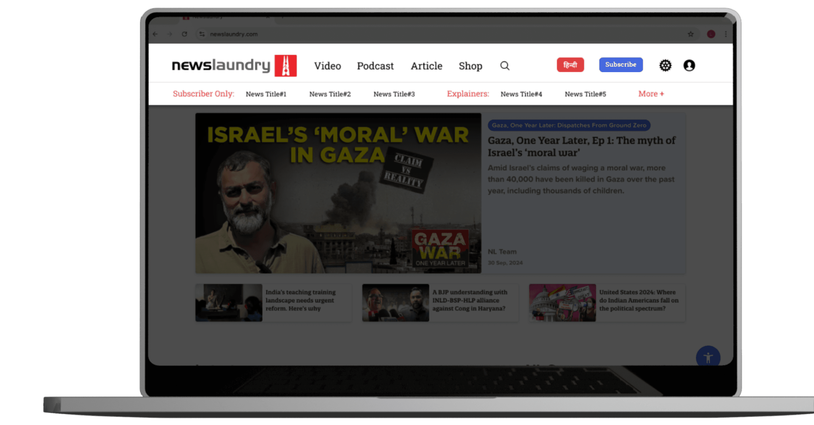
Video
Podcast
Article
Shop
Subscriber Only:
News Title#1
News Title#2
News Title#3
News Title#4
News Title#5
Explainers:
More +

Subscribe
हिन्दी


Grouping key categories by media sources
Adding a second line of navigation to feature unique news
"Seeing users struggle, I redesigned the navigation to group content clearly and add a second line for quick access to key news."

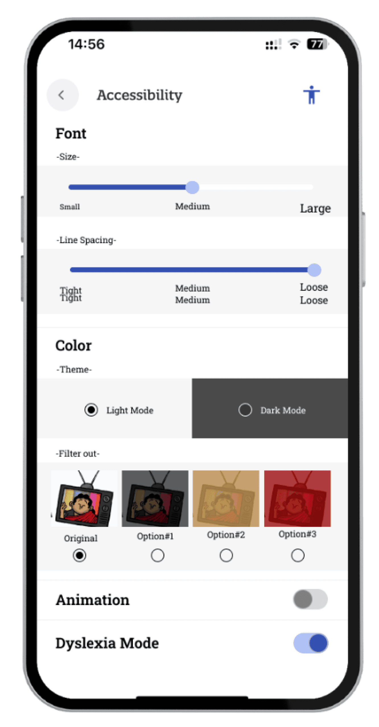
"I redesigned the accessibility settings to offer more control over their experience."
Re-designed Accessibility
Expanding customization features
Visualizing the effect of the adjustments
Original Accessibility
"Users struggled due to limited customization options and inefficient use of space."
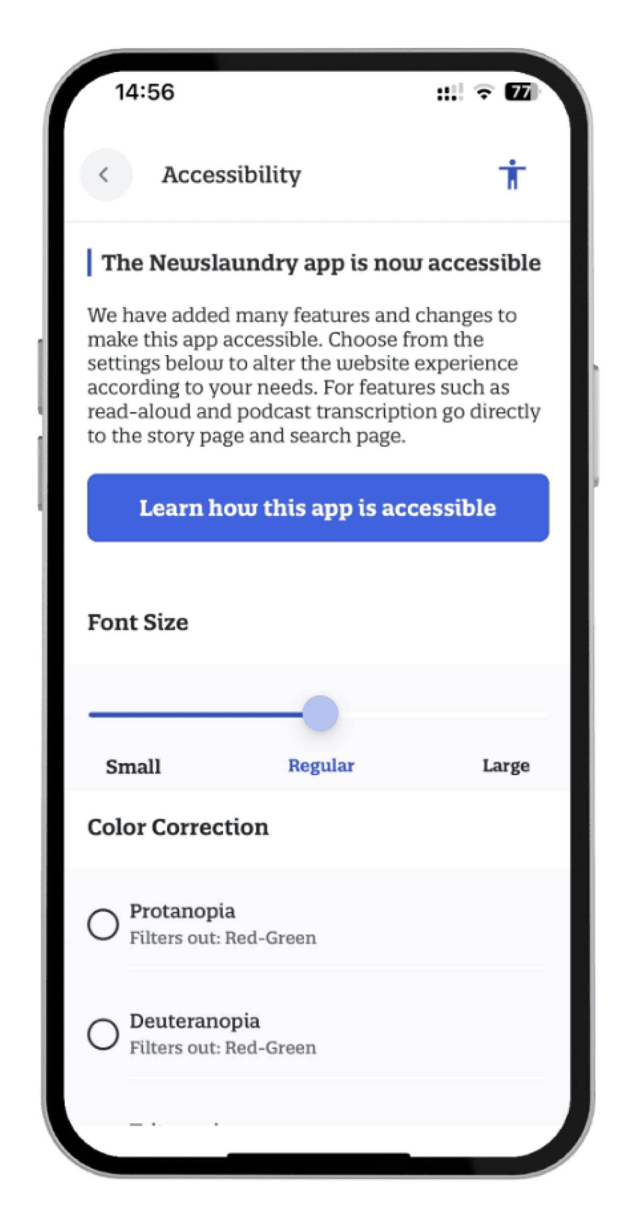
02 Accessibility Gaps → Expanding Customization
Shaping the Future
What We Learned and What’s Next
"Moving forward, we plan to gather feedback on the redesigned features and continue refining customization options based on user needs. Our next step is to explore integrating advanced accessibility tools and improving real-time visual feedback to enhance usability further."